
We used a range of tools to grade our film opening. The software includes Adobe Premiere Pro and Adobe After Effects.
We had 3 different styles of grading that we needed for our narrative:
- The night/early morning dark shots.
- The light late morning shots.
- The corridor shot.
Grading for the Light Late Morning shots was extremely difficult for us as a group as we were unable to come to a uniformed decision about what kind of mood we wanted for these shots. Eventually we came to the conclusion that we wanted to have a slightly unkempt feel to it, we didn't make it easy for ourselves when we were shooting however. The room we were using had very strong purple walls, with purple and white bed sheets and pillows; due to us not having the correct filter for our lighting we ended out using as purple filter which only intensified the purple tinge on most of the footage. Even some of the whites of the bed sheets ended out looking purple due to the lighting.

To get over this trouble, this is how we chose to grade our shots:
As you can see we increased the saturation and contrast to try and combat this very purple tinge to our shots, as well as lowering the brightness to really bring out the different colours in costume between Jess and Alex.
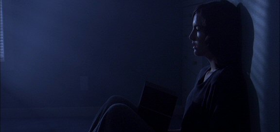
Grading for the night Shots
 |
| Before Dark Grading |
 |
| After Dark Grading |
We took reference from David Mullen's work:
No comments:
Post a Comment