Friday, 14 March 2014

Editing

To edit our sequence, we used Adobe premiere pro which allowed us to edit on multiple tracks.

Many of our shots were cut so that they were fairly short to ensure a constant pace throughout the project. There were very few times when we added in effects between shots, we mainly just cut from shot to shot. The reasoning behind this choice is because we felt that adding in an effect would detract from the scene and we want the intense emotions in our scene to be maintained.

 So that we had a guideline for shot length, placement and the placement of our titles, we used a feature on Premiere pro enabled us to lock the tracks containing the original positions and gave us a template to use for the rest of our editing sessions. This was very beneficial, because it allowed us to edit our sequence without every member of our group being present as the general positioning of things in the sequence had already be predetermined as a group.

The responsibility for editing was shared equally throughout the group, unfortunately due to timetable constraints it was increasingly difficult to all come together and edit as a group. Fortunately for us, we took full advantage of the editing slots which took place both before and after school, spending many mornings and evening working together as a group and each having major contributions to the way in which the sequence was put together.


Back up Shoot


We wrote out the lines for the
actors to read during the
mastershots as prompts.


After our main shoot, we realised there were many shots that we had to reshoot, so we had to reshoot everything on our back-up shoot.

We started the day at 9:00am and it lasted until 9:00pm.

Since the lights were heating up very quickly we needed to have many breaks.

We knew what we wanted. We needed to get the props and footage filmed in the right way. When we struggled to explain the situation that the actors needed to act, we filmed ourselves on our phones and then showed them the video on what to do.

This enabled them to easily understand what we were trying to capture in our film opening.


Back Up Shoot Storyboard Sample

Back Up Shootboard sample page


Pre-production: final edited version of the script


Throughout all the shoots, we have been constantly altering our initial script.

Although our final script turned out slightly different to the first one, we were able to use the first script as a template during the shoots to work with the actors and alter our script to give the main characters some depth.

Our script is developed from the script mentioned in the "Treatment: Scripting our sequence" blog post.


We changed the dialogue to develop our characters through the opening sequence and to build up a better sense of tension.

As an example, our group found that the line, "Rise and shine sleeping beauty" was too cheerful for the situation so we changed it to "Jess, it's time to get up."

We are more satisfied with the script now as it allows us to build up the characters and seems like a realistic conversation instead of being very stereotypical and exaggerated like our previous script.

Making our titles


We made the titles on Livetype on the mac.

We used a free font called Milford Black. We set the colour to white and made the outline colour grey so the titles would stand out when imposed upon white props in the footage.

When we made the titles, we aligned the writing to the side it should appear on in the sequence.

When writing some of the credits e.g. "Directed by Josh Stevenson", the "Directed by" was set to size 60.0 and the name "Josh Stevenson" would be set to size 72.0.

We added in a film dissolve to both the start and end of the titles so that they seemed to flow throughout the sequence.


Thursday, 13 March 2014

Production Company Title

We had already chosen the name for our production company "Frozen Productions" and had a general direction to head in in-terms of the logo because of what people automatically associate with the term frozen. We contemplated various routes to head down, our first idea was to have a clock with its hand constantly stuck between two seconds; however due to the period of time the logo would be on screen for we thought it best to have something much simpler which the audience would not have to spend time trying to work out the meaning of the logo.

This is the end product:

It is exactly what people assume they will see when they hear of frozen productions. We had very little prior knowledge of how to use Adobe After Effects, so in order for me to be able to create this animation we found an online tutorial of how to do the wanted effect and made some slight changes to put our personal stamp on it.

  )

Our Background Music


This is the audio that we used as the backing track of our film opening.

We asked a fellow student, Shannon Balram if she could play her composition for us. She recorded herself playing it. This composition was originally a song; we thought it was better as an instrumental version.
This enabled us to have copyright-free music that we didn't have to pay for.

We decided that the piece by Shannon Balram was suitable for our piece because of its fairly slow pace and the emotions it invokes in audiences. It tells them that the situation is far from ideal for the characters, connotes the main characters mood and creates an atmosphere that feels quite fragile.

For a reference, we looked at "Remember Me" whose score fits our preference of a fragile atmosphere being created. As well as this there are points in the score where the volume and pace increases which connotes an increase in the intensity of the characters emotions.


Wednesday, 12 March 2014

Pre-production: Storyboarding


Before all our shoots, for the storyboard, we drew out the shots we planned to use on post-it notes which we then placed, in order, onto a pieces of sugar paper. This also allowed us to see whether we had too many of the same framing shots together or not and it gave us a sense of how the film opening to turn out to be.

We used a colour coding for the shot framing as show below:

Colour coding for different framing of the shots
This helped up create shot diversity and realise any continuity rule breaks
We then used our storyboard to create our animatic. Then for the test shoot, we were able to create a more visual storyboard with the pictures from the animatic to allow the actors, as well as us, to understand how the shot will be filmed and what they would do in it.

Test Shoot Storyboard


Tuesday, 11 March 2014

Grading


We used a range of tools to grade our film opening. The software includes Adobe Premiere Pro and Adobe After Effects.

We had 3 different styles of grading that we needed for our narrative:
  1. The night/early morning dark shots.
  2. The light late morning shots.
  3. The corridor shot.
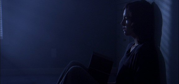
For the early shots we planned to create a sad and depressed atmosphere using the Pro-camp video effects on Adobe Premiere Pro and Color Finesse 3 in Adobe After Effects. This was our first time grading shots to look like it is the night/early morning and as such none of us quite knew exactly what the standard way for grading to look dark is. To overcome this we did in-depth research into different films that also have shots indoors when light is supposed to be minimal.

Grading for the Light Late Morning shots was extremely difficult for us as a group as we were unable to come to a uniformed decision about what kind of mood we wanted for these shots. Eventually we came to the conclusion that we wanted to have a slightly unkempt feel to it, we didn't make it easy for ourselves when we were shooting however. The room we were using had very strong purple walls, with purple and white bed sheets and pillows; due to us not having the correct filter for our lighting we ended out using as purple filter which only intensified the purple tinge on most of the footage. Even some of the whites of the bed sheets ended out looking purple due to the lighting.


To get over this trouble, this is how we chose to grade our shots:

As you can see we increased the saturation and contrast to try and combat this very purple tinge to our shots, as well as lowering the brightness to really bring out the different colours in costume between Jess and Alex.


Grading for the night Shots

Before Dark Grading
After Dark Grading


We took reference from David Mullen's work:

As you can see, they chose to grade their shots by adding a blue tint to everything. We felt that this was a very effective way of creating the convention that blue means darkness to the audience. As well as creating this convention, it allows the audience to get a sense of time of day (night time, so very dark) while still being able to perfectly see everything that is happening within the film. We used Adobe After Effects to give our dark scenes this effect, within After Effects there is a preset names SA Color Finesse 3 which allowed us to do much more intricate work than would have been possible on Premiere Pro alone.


Monday, 10 March 2014

Pre-production: Props and costume list


Our piece relies on props and costumes in order to convey the current state of mind of the Jess.


Beer bottles/cans and clothes strewn on floor


The props that we included in our sequence include:


-Alarm clock that lights up
- Bottles of Alcohol
-Bin
-Rubbish (leftover packets of food/bottles of alcohol)
-Clothes strewn all over the floor
-Make-up on the side table and mantel piece
-Extra clothes (that can be thrown at Jess)
Shot of Alarm clock as Jess ignores it
-Pictures of her and her family/friends


The costumes for the characters are very simplistic.
Black Shirt
Grey Jogging Bottoms
Black Chinos
Green Shirt
Jess:

-Black plain shirt
-Grey jogging bottoms

These were chosen as her sleepwear and to show her opinion on her appearance due to her current state.

Alex:

-Plain green shirt
-Pair of black chinos

We made Alex wear a coloured top in contrast to Jess who had a monochrome costume. Showing how he would be the one to help her later on.

Friday, 28 February 2014

Continuity Issues to resolve in the back up shoot


Arrangement of clothing on the floor: 
-To overcome this will take pictures of the floor that clearly show the positioning of everything on the floor of the set.

Position and Arrangement of Props:
-Again photography will be extremely useful in remembering the exact placing of these props.


Position of Blanket and pillows on the bed:
-We will set a position on our actress' body where the blanket will be pulled down to in one of the early shots and ensure that it is always at that length.
-In regards to the  pillows, we will have a set arrangement for them and take a picture after each moment in the scene where the pillow is required to be moved, so that we can use it as a reference point.

 Ensure no production equipment is in shot:
-Store any extra equipment i.e. camera bags, chargers, lighting filters off of set in the corridor outside of the room used for filming.
-Have a set location for the lighting for each shot and if lighting does need to be moved for the shot, then the new positioning is as such that the lighting kit cannot be seen in frame.

Timing and order for placing beer bottles/cans in the bin:
-We will set a memorable phrase which clearly indicates what is picked up in which order e.g. BCBB       (B- Bottle C-Can)
- Have a set time between placing one object in the bin and picking up another of 1-2 seconds.
Don’t interfere with the setting:
Especially during breaks, instead move to another room to take breaks so that we can ensure nothing is moved from its original positioning.

Ensure door is open in all shots required:
-Set a predetermined position for where the door will be opened to and place a marker so that we know instantly if the positioning of the door is incorrect.


Leave any equipment on the floor in a part of the set which is never seen.

Ensure the lighting for the corridor is maintained throughout the shoot. (Best to set up lighting beforehand)
Make sure the characters move in the same way in match on action shots.
The shot when Alex's head rests against the door needs to be flipped or the entire shot revised so as not to break the 180 Degree rule.

Monday, 24 February 2014

Main Shoot: Reflections

Our main shoot happened on Monday 17th February 2014. We started setting up at 9:00am. Since we were at a new location we had to block the location and plan how we would set up the lighting and equipment.


We had to make setups that would be fairly stable and also equally light the scenes that we filmed. The two diagrams show a rough layout of the room.


Our mise en Scene

When we arranged the mise-en-scene we took multiple photos of the props as they would be moved during filming and also get moved when people walk through. Although we took photos the props ended up moving.


We forgot the light the doorway when we were filming which created discontinuity as Alex is later pushed into a lit corridor.


Friday, 14 February 2014

Main Shoot: Storyboard and Shootboard

We made a storyboard and shoot board in preparation for our main shoot at our new location.

Storyboard for Mainshoot Sample

We adapted our storyboard to the rough edit of the test shoot sequence incorporating additional feedback and reflections into our new storyboard.


Shootboard for mainshoot sample with visual representation from the animatic


We tried to structure our shootboard as much as we could based on setups. This was difficult as we hadn't been in the room that we are going to film in.
If the setups don't match up well, we will shoot in order of the storyboard so there will be continuity of the drama.

Test Shoot and Edit Reflections

We had a test shoot in order to test out different practicalities of the shoot such as lighting props and blocking. Our edit enabled us to test the durations and the narrative that we conveyed through our shots.


Student Reflections

  • The way Alex grips Jess in shot 21 seems too violent for the situation. Instead we plan on having him approach her by her shoulders and then for her to push him out of the room.

  • Setting up lighting for the beginning dark shots was difficult as the lighting was too bright initially. We then had to use many filters to get our preferred lighting. However the footage was very blurry when we came to editing it. Therefore, we will now film these scenes in naturalistic lighting that appears very clear and then grade it down to our desired effect.

  • Another problem with the lighting was that the gels merged into each other so they were damaged easily.

  • We struggled to position the equipment suitably so the equipment wouldn't appear in shot as the space in the room was small. There is a possibility that we may shoot in another location. 


Staff Reflections


  • They suggested for us to shoot master shots that we could refer to if our shots did not fit as well as we imagined it to have.

  • We should also include more cutaways to increase the pace of the narrative.

  • When we edit shots together we should edit it so the shot starts when the actors are moving. Since we had some shots that started with the actor standing still ready for the shot to start.

  • Mise-en-scene looks like a room of a busy teenage girl, instead of a depressed teenage girl.

What we plan to do:
  • During the next shoot, we will film the master shots so when we come to editing we would be able to use it as a backup and maybe cutaway to it.

  • We took the advice about the cutaway and improved out first test shoot edit by making more cutaways and therefore increasing the pace.

  • When we next edit our shots, we would have the master shots so if an actor is static at the beginning of the shot, we could cut to the master shot of them as a back-up.

  • As for the mise-en-scene, we plan to redress the whole room to give connotations of a depressed teenage girl. We would get rid of the student books and maybe have ripped pieces of paper from her diary or a pile of used tissues that the main character has used to wipe her tears.


Friday, 7 February 2014

Test Shoot: Storyboard and Shootboard

Call Sheet
Before the test shoot, we had to plan ahead  by making shootboard, storyboard and we made sure we booked our actors for the test shoot.
Since this film is both of their acting debut the test shoot will introduce them to the routine of the shoot.
This will allow them to rehearse their characters in front of the camera. It will also help us understand how our characters are depicted by our actors and we will be able to determine the strengths and weaknesses of our script so far.


Test Shootboard


We created our shootboard according to priority of casting and set ups so the actors could rest when they weren't in the scene.The set ups were also categorised because the room is small and camera equipment needs to be moved around carefully to  make sure it doesn't appear in our footage.

Pre-production: Costume research

Costume:

We had Alice Soulard try on her pyjamas to be able to choose which clothes will work best for our character, Jess. We want Jess's mood to be upset and frustrated. We want her to have an unwashed stale look.


We had Alice take pictures of the different clothes so we could trial them on her. 
We had Anthony take pictures of different outfits that fit Alex's character
Out of the costumes we thought the black pyjama top and grey pyjama bottoms suited our character the best. This seems to resemble the pyjamas of a 19 year old. The colour black is usually worn in mourning so thus relates to her going through depression after her boyfriend's death. We thought the others were too colourful to reflect the emotions of Jess.


Costume References:

Silver Linings Playbook (2012):  Tiffany wears black throughout most of the film. She has been impacted by the death of her husband.


We decided that we wanted Anthony, who plays Alex, to wear casual clothes since he is ready for university and is optimistic about life. We thought that his T-shirt should be pastel coloured to contrast the dark clothes that Jess wears.
In the end we asked him to wear his un-patterned green T-shirt and black trousers. The plain nature of the T-shirt doesn't pull too much attention from the audience and it resembles how simple and jovial he can be.


Costume References:
This is Adam from Now is Good (2012). He wears casual clothing and is generally more optimistic in the film. His role as the love interest is similar to our character of Alex as they care deeply about the respective female leads deeply.


Wednesday, 5 February 2014

Planning our post-production: Integrating Titles


Our titles will have no interaction with the sequence, we want to keep everything simplistic because of the nature of our film and the conventions associated with our chosen drama.

-The titles will be very stylised and simple so that they are noticeable, but not distracting.

- Their placing will be around the edges of the screen and in corners where possible.


- The main title will follow a similar style to the production titles, however it will be central on the screen and be much more noticeable. We want the audience to see the main title and be inquisitive in regards to the meaning behind the title.

- The colour chosen for our production titles: because of the purple colour of the walls of our location we felt that much darker colors blended into the wall and could not be seen; while light colours like yellow and bright green didn't suit our film and just looked out of place.


-We made the titles fade in, so it would not suddenly appear and distract the audience from the main focus.


Reference:

Our main inspiration for our sequence is "Struck By Lightning" which has titles that are plain white and non-intrusive. The film "Struck By Lightning" has some very dark themes and similarly because of this keeps everything else simple.


Pre-production: The Main Title

What a mess
We were unsure how we wanted to use typography to brand our film so we set about researching fonts that we could use for our title. We wanted to keep the shaping of the letters simple. We also wanted to create the neat graphic with solidly filled letters.


Castorgate Distort


Rough Rider


Reference: Remember Me (2010)

Reference: One day (2011)

Noir-Et Blanc
 We chose the font called "Noir-Et Blanc" since the letters are stretched. We thought that this represents the theme of reaching out and being helped up. It also fits in with titles that inspired us such as Remember Me and One day. The difference would be that our title is in mixed cases. It still fits in as it is a bold white colour that stands out but also doesn't detract from the scene.


Monday, 3 February 2014

Animatic Reflections

An Animatic is basically a sequence of photographs that represent each planned shot, all put together with any planned sound effects. Each photography is shown for the planned duration of the shot it represents.

We made an Animatic so that we were able to get a general idea about where the camera will be placed for each shot, as well as being able to make adjustments to a shot i.e. framing and composition if it doesn't look quite right. Since we did shot the pictures for our Animatic at the first designated location, we were able to get a sense of how we were going to film the shots.


After we made our animatic, we looked over it with criticisms that are listed below:

Student Reflections

While we were shooting and editing our animatic, we realised that there were certain issues that arose including:

- Continuity errors:
  • In some shots, the bed was left empty. To rectify this, we will ensure that Jess is always in the bed where appropriate.
  • There were various issues in regards to Mise-En Scene. E.g. Posters on back wall constantly falling; "Monster Energy" cans stacked against wall fell over repeatedly
  • The 2 lighting set-ups must be kept consistent, especially in scenes when using low key lighting. To enable this to be consistent we will use a lighting kit provided by the school.
  • The alarm clock needs to be set to the right time each and every time we shoot the close ups of it (the clock) at the start.
- Mise-En Scene:


  • Be mindful of large mirror on wall, to avoid reflections of crew members and equipment.
  • Suitable lighting needed so that actors are visible in low key lighting.
  • Certain props are missing and therefore are not in


Staff Reflections


-Titles:
  • There should be consistency in how the titles are sequenced.
- Scripting
  • The intonation used in some of the lines does not quite fit the scenes mood, this is due to all of the dialogue being added in at a later date as a voice over and will not be a problem when filming the sequence.
- Composition:
  • There should be more shot diversity
  • There should be more cutaways


One major piece of feedback that we were given from staff is that there is a lack of movement in our sequence. This is mainly due to the limitations of an animatic's static nature and is hard to fix unless there are a variety of transitions between separate shots.


These are all things which will be taken into account when we move on to the film opening's construction.